Posts

Showing posts from 2009

Typeface Portraits

Image
by Leslie Nichols Experimenting with text and image has become endless source of ideas and inspiration central to my studio practice. Letterforms create both spatial and literary passages, which provide a visual texture that is exciting and sometimes challenging to work with. It has been a natural evolution to use writing in my visual work. Informal sketches while doodling or writing letters to friends were my first calligrams. I began incorporating text in my fine art portraiture when I discovered a typewriter was an exciting image making tool. Experiencing the beauty and history of the English landscape first hand inspired my current paintings and prints. We lived at Harlaxton Manor in rural England for four months while my husband was a Visiting Professor at Harlaxton College. In these landscapes human presence is presented with text rather than by a plume of smoke, a village or man with cart. View more about Leslie Nichols and her work at www.NicholsStudio.com www.NicholsStudio.bl

Visual words for interiors

Image
"ModernMantra is a series of 18 "text drawings" made in Indian ink on white paper. In a somewhat schematic fashion they portray sterile and depopulated interiors, often simply but properly furnished. One does not have to get very close to them to see that the drawings are really calligrammes, that the interiors are drawn with words that simultaneously describe what they depict." says Kim West in his text "The Mutant Nerd" in the catalog ModernMantra produced for the exhibition at Borås Konstmuseum (Sweden) in 2006. Thomas Broomé is the artist of these calligram interiors ModernMantra . He is a contemporary artist born in Malmö (Sweden) in 1971. View the calligrams of ModernMantra and seven new addition just presented in an exhibition at the Galeri Magnus Karlsson in Stockholm.

A bag made by words

Image
This is a plastic bag that "carries" a very meaningful statement. Designed by Thorbjørn Ankerstjerne while he was a student. I think this design could be included in the "Good Work Project" where good work happens when excellent and ethic meet . But so far it's included in the book New Packaging Design by Janice Kirkpatrick that features over 80 packaging designs from all over the world.

Images of YOU

Image
Here is another example of images as letterforms. The letters Y, O, and U, are formed by images of YOU. This is a screen shot I took from an online ad. It was late in the night and I did not notice from and by whom it was created. Maybe Facebook? Vodafone? Please, if you know more details, write a comment below, I will appreciate it. I can recall that you could roll over on the single image and a little pop-up opened to show the name and more details of the person. In this blog you can find other examples of images as letterforms . Let's notice what they have in common: - the letterforms are formed by the object or meaning of the word itself. In this case the word YOU is formed by individual "you-s".

Joni Mitchell

Image
by Ben Duarri-Screen Prince Joni Mitchell was the first portrait of a female I attempted, shortly after discovering the pointed pen nib used for copperplate and flourishing. Copperplate became the modern hand at the end of the 19th century and has since become a favorite for popular sign-writing and commercial graphics. A delicate and smooth flowing hand, it can be written quickly using one continuous line [unlike gothic script] and can be dressed down to a basic joined up writing or dressed up accentuating the loops and curves and because of the nature of the nib, when pressure is added, the line widens adding curve and sensuality to the words. These words, from A Case Of You on her hit album Blue , draws from the metaphor of her lover being like fine wine, “I could drink a case of you and I would still be on my feet”. However the song is not just a compliment, there is a sense of sadness, a splitting and ending of a relationship and the drinking in bars to numb the hurt

A calligram with... touch!

Image
Type your word, draw your picture and get a calligram in few seconds with TypeDrawing with just a touch. It is so easy and fun! TypeDrawing is an application for iPhone and iPod Touch. Like calligrams, drawing with letters is what the application is all about. I was amazed the first time I tried it on my husband's iPod Touch! - I typed the sentence, Everything is all right, right now. - I chose a white background paper - I selected the font style, its size, color and opacity - and then just let the intuition flow and drew a vase of flowers, just with my index finger! Then - I saved it in an iPhoto Album - went into iPhoto and sent it directly to my husband as a sign of gratitude for introducing to me such an interesting and fun application. And all within few minutes. On Flickr there is a TypeDrawing Group Pool and it's clear how many people are enjoying and using their creativity with this tool. I am exploring it daily and I am finding it truly amazing. It allows an entirely

Free your mind

Image
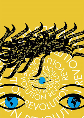
by Rick Ligas Some of us believe that the only real revolution is the personal revolution and that the only peace that exists in the world is our own internal peace of mind and heart. This calligram, titled Free your mind , by Laura Ruggeri , shows that belief in a clear and subtly powerful way. Looking at a world that seems so unpeaceful (even if, on any given day, there are billions more peaceful people than non peaceful people) we are reminded that peace starts within each of us and flows out to our family, friends and beyond. It doesn't exist anywhere else. This lovely calligram quietly reminds us that there is nothing mysterious or difficult to understand about world peace. It reminds us that world peace is simply our individual peace of mind and heart naturally projected into the world from our daily actions. If we want a peaceful world we have the responsibility to become and remain peaceful individuals. "Free your mind instead" comes from the lyrics of Revolution

Letterforms made by STUFF

Image
The word STUFF is part of the logo-title designed by Ruben DeLuna for the very succeful 20-minute documentary THE STORY OF STUFF with Annie Leonard .  "The Story of Stuff exposes the connections between a huge number of environmental and social issues, and calls us together to create a more sustainable and just world. It'll teach you something, it'll make you laugh, and it just may change the way you look at all the stuff in your life forever." says Annie. As you can see the letterforms are made by stuff that everyday we consciously or unconsciously buy, collect, store-and-forget-we-have, stuffing our environment and, most importantly, stuffing our mind. In the yoga tradition the mind is called "citta vrtti" translated in english as "the mind stuff". Stuff that comes from the past and stuff that we desire in the future could be objects, memories and emotions that in some way stuff our lives. Try to open your closet. Can you find something you do

A Summer of virtues

Image
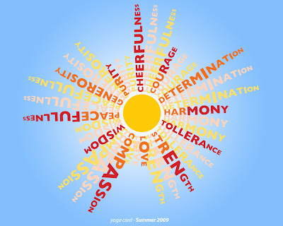
a yoga calligram card by Laura Ruggeri From the depth of my heart I wish you a Summer full of: cheerfulness compassion courage determination friendliness generosity love openness peacefulness purity strength tolerance trust wisdom These are in alphabetical order only for convenience but... let's set up our priorities and sincerely follow them! May this Summer shines from within You.

Jimi Hendrix

Image
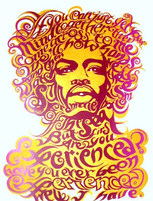
by Ben Duarri-Screen Prince The third calligram in The Royalty Series , Jimi Hendrix , is entirely hand drawn lettering using lyrics from "Are You Experienced?" , from his break-through album of the same title. I drew from the phsychedelic posters of the time such as Martin Sharp's Bob Dylan cover print of Oz magazine,“Blowing in the Mind” and the work of John Van Hamersveld, Stanley Mouse and Alton Kelly, among others. Here, Jimi is elevated to a sun-god status, a messiah of rock and roll, with little sun rises in his eyes and mouth refering to the line “ we'll hold hands and then we'll watch the sun rise from the bottom of the sea... ” that makes up his jaw and arched moustache and side burns. The overall impression I wanted to acheive was that of an apparition or hallucination in a cloud of purple smoke and golden sunlight passing through it. So far, one edition of 20 of the classic gold -lightly blended with green edges at the beginning of the run- and purple

Prince

Image
by Ben Duarri-Screen Prince This, the first of my The Royalty Series , a portrait of the mercurial artist known as Prince . Using the lyrics of his dacefloor classic b-side to Lets Go Crazy - Erotic City, Prince at the height of his Purple Rain era circa 1984. The song was hard to single out from such a vast opus, but the reference to bringing to life a whole dark erotic personality of a city, ”funking in2 the dawn” and ”creamy thighs“ swayed it. I set out to make an image that was truly erotic only using the lyrics, face and eye contact with the viewer. I looked at lace and lingere, decorative motifs and flourishing from baroque to art-nouveau and blended it with Shakespearian calligraphy. All the letters were constructed with pen and ink and correction pen then photocopied. So far, only one edition on A2 stock printed in a tinted gold blend and purple and magenta blend has been printed along with three small Artist proof editions of seven, on coloured papers and soft col

The Cult of the Calligram

Image
With this post we'll start showing the calligram art work by Ben Duarri-Screen Prince . by Ben Duarri All my work is hand drawn, mostly using dip pens, written in ink and screenprinted as a 2 colour screenprint in gold and blue or purple and maybe more colours. Calligrams stimulate both sides of the brain simultaniously creating balance and the opening of the 3rd eye. I am starting The Cult of the Calligram and I want to bring calligrams and the making of them to a new generation reared on mind supresants and imagination killers. I want to find ancient middle eastern calligrams and 20th century european calligrams and contemporary calligrams and calligrams from all time and space that ever were are and will be and gather them together and give a whole generation the tools to communicate with joy and passionate poetry that can only be achieved by creating calligrams. I have spent the last four years making and printing, making and printing and now my first series of calligrams: The

Le bouquet

Image
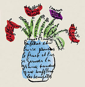
Guillaume Apollinaire created the calligram Le bouquet for the catalog cover of his friends’ art exhibition: Peintures de Léopold Survage. Dessins et aquarelles d’Irène Lagut. - Paris, 21-31 janvier 1917. The original publication seems to be a very rare treasure for visual poetry: 12 calligrams, printed in facsimile after drawings by Apollinaire, never before published. More info: - Apollinaire, visual poetry, and art criticism by Willard Bohn - ILAB - LILA

Forsythia

Image
Finally spring arrived showing its first splendor with the forsythia! I was walking this afternoon and saw the yellow forsythia around the corner... it reminded me the famous concret poem by Mary Ellen Solt, Forsythia, composed in 1965 and published in 1966. “The design of Forsythia is made from the letters of the name of the flowering shrub and their equivalents in the Morse Code. The text is part of the design.” ~ Mary Ellen Solt " Forsythia by Mary Ellen Solt was typographically concretized by John Dearstyne. In the introduction to Flowers in Concrete , George Zadek writes: “Traditionally the typographer has given form and order to words, thus serving both the writer and the reader. His problem is mainly one of clarity of communication, literary meaning, and hopefully aesthetic contribution to the art of the printed page. When publishing concrete poetry, it is sometimes difficult to draw a line between the contributions, as well as the final responsibilities, of the poet and

Woman's Day

Image
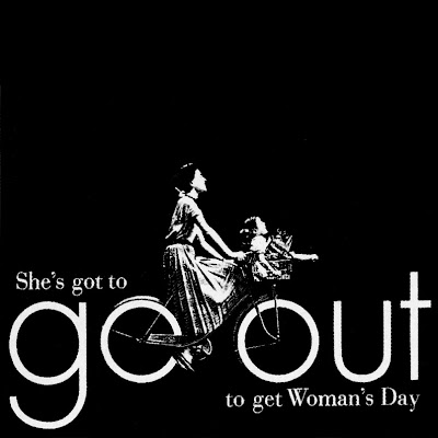
Go out  Federico Gene Advertisement for Woman's Day Magazine, 1953. All rights reserved. [...] Federico’s best-known ad for Woman’s Day typifies this rhythmic sensitivity. It has the catch-line “Go Out,” and shows a photo of a woman riding a bicycle with wheels made from the two lowercase Futura ‘o’s in the headline. The aim of this ad was to persuade potential advertisers that three million-plus devoted readers went out of their way to buy this check-out counter magazine. The ads apparently did well for the client, but more importantly proved the power of persuasive visual simplicity in a field that often errs on the side of overstatement. [...] From  Gene Federico: The Art Director’s Art Director  by Steven Heller. Read more info about Federico Gene on  AIGA and  New York Times .

Images as letterforms

Image
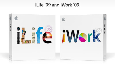
Apple, Inc . chose the technique of "images as letterforms " for the just released new versions of iLife and iWork 2009. The words/logos iLife and iWork are made by images which show some of the features and capabilities of the two products. This technique is very creative and not so easy to do, in fact it's not so popular, but when it's well done it's very effective from a marketing point of view: easy to remember! Other beautiful examples of the use of images as letterforms are: - the cover for the book "WORLD DESIGN" designed by José Conde , published by Rizzoli International Publ., New York, 1992 - the logo for the film documentary "Objectified" designed by Michael C. Plac e .

Ai (Love)

Image
by John Ecko This poem was one of the most challenging calligrams to date for me. I was fascinated by the beauty of love found in so many different written languages of the world and was inspired by the Japanese expression for it. Though there is so much diversity out there, Love is still the universal language and hope of mankind. I hope you enjoy this visual poem from my new book " Signs of Life " and please feel free to visit my visual poetry site at http://eckovision.wordpress.com/ to see more of my work and to find out more about my book. Thank you for listening to my words and seeing a little of what I see.

Love

Image
by Laura Ruggeri "L" as a heart, a heart full of "L", "L" as in Love, it makes a heart full of Love! ... because as we very well know Love is all we need.

Happiness Is

Image
by Eddie Vasquez The idea for this came to me shortly after I saw the trailer for Happiness Is . I was so compelled by the words. It was a little emotional. I felt it with all my heart. That was the lightbulb! I wanted to use the words from the United States Declaration of Independenc e as the "Heart" of Happiness Is. I'm glad it has been well accepted.

100% natural fonts!

Image
Vegetables, fruits and cereals can become digits (Carrefour Italia) or an entire alphabet for a new line of soups (Star) or to illustrate an article about health care (by GigiGreen)... 100% natural fonts!