Posts

Showing posts with the label advertisement

Calligrams for sale

Image
See how curvaceous body text is used for these calligrams featured on the tags of the 2010 Summer collection at la Rinascente in Milan, Italy! Maybe it's becuase they follow very curvaceous feminine bodies? Maybe it's becuase they follow the 60s' fashion trend for the 2010 Summer? No matter, the result is very appealing and catchy. It's always very inspiring to see how the visual communication technique of calligrams is used more frequently for business and marketing. PS "sconto" in Italian means "discount" and "saldi" means "sale"
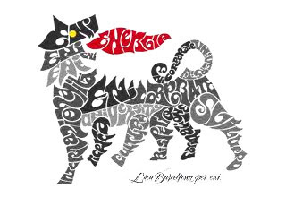
Six-legged dog calligram

Image
Eni transformed its famous and historic six-legged dog logo into a calligram advertising its "Master in Energy, Environmental Management and Economics" program at Eni Corporate University. The audience for this calligram is young, intelligent, creative, sensitive... students from universities called to be trained in strategic planning, business analysis, relationships with regulatory authorities, etc. in the specific context of energy and environment. The calligram is formed by hand-written words recalling the sixties. The six legs say (from left to right): internazionalità (internationality) ricerca (research) cultura (culture) rispetto (respect) formazione (education) sviluppo (development) The main part of the body of the dog is taken by the name of the company's educational facility "ENI CORPORATE UNIVERSITY" (notice the capitalization). The head is the company's name, "eni" while " energia " (energy) is reserved for the red spit flam...

Images of YOU

Image
Here is another example of images as letterforms. The letters Y, O, and U, are formed by images of YOU. This is a screen shot I took from an online ad. It was late in the night and I did not notice from and by whom it was created. Maybe Facebook? Vodafone? Please, if you know more details, write a comment below, I will appreciate it. I can recall that you could roll over on the single image and a little pop-up opened to show the name and more details of the person. In this blog you can find other examples of images as letterforms . Let's notice what they have in common: - the letterforms are formed by the object or meaning of the word itself. In this case the word YOU is formed by individual "you-s".

Woman's Day

Image
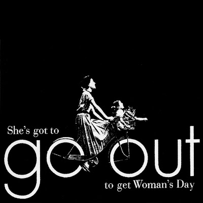
Go out  Federico Gene Advertisement for Woman's Day Magazine, 1953. All rights reserved. [...] Federico’s best-known ad for Woman’s Day typifies this rhythmic sensitivity. It has the catch-line “Go Out,” and shows a photo of a woman riding a bicycle with wheels made from the two lowercase Futura ‘o’s in the headline. The aim of this ad was to persuade potential advertisers that three million-plus devoted readers went out of their way to buy this check-out counter magazine. The ads apparently did well for the client, but more importantly proved the power of persuasive visual simplicity in a field that often errs on the side of overstatement. [...] From  Gene Federico: The Art Director’s Art Director  by Steven Heller. Read more info about Federico Gene on  AIGA and  New York Times .