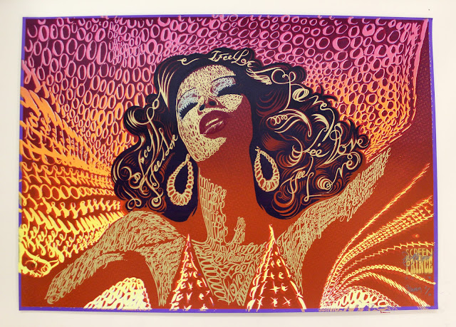
Images as letterforms
 Apple, Inc. chose the technique of "images as letterforms" for the just released new versions of iLife and iWork 2009. The words/logos iLife and iWork are made by images which show some of the features and capabilities of the two products.
This technique is very creative and not so easy to do, in fact it's not so popular, but when it's well done it's very effective from a marketing point of view: easy to remember!


Other beautiful examples of the use of images as letterforms are:
- the cover for the book "WORLD DESIGN" designed by José Conde, published by Rizzoli International Publ., New York, 1992
- the logo for the film documentary "Objectified" designed by Michael C. Place.

Apple always does a wonderful job with their packaging. They create a sense of quality and value right from the first contact. It's nice to see them using the letterforms.
ReplyDelete