Posts

Showing posts from August, 2008

Bembo's Zoo

Image
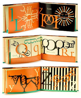
by Roberto de Vicq de Cumptich Very creative calligrams of animals using the font Bembo. The book published by Henry Holt and Co. is available on Amazon . But it's very interesting to watch the same calligrams "animated" on the website BembosZoo.com . Here the use of Flash, motion and sound add more character to each animal/calligram. "This high-concept abecedary, the picture book debut for de Vicq de Cumptich, should delight collectors of stylish picture books and aficionados of the graphic arts" —Publishers Weekly "In this first book for children, de Cumptich,... has created an abecedary of animals made entirely from bembo letterforms and punctuations marks-nothing els. And you know the conceit works." —New York Times It's just a joy to see these calligrams. Bravo Roberto!

Objectified... word

Image
" Objectified is the new film from director Gary Hustwit . It's about industrial design, and the creativity at work behind everything from toothbrushes to tech gadgets. It's about the people who re-examine, re-evaluate and re-invent our manufactured environment on a daily basis. It's about our relationship to mass-produced objects and, by extension, the people who design them." (from HelveticaFilm.com website) ... and the calligram logo speaks clearly what the documentary film is about. Notice In this case the concept of the calligram is reversed: it's not the image made by words, but the word made by images... well, objects. So, how can we call it? perhaps "objectified" word . Calligram design by Michael C. Place .

Oh Julie

Image
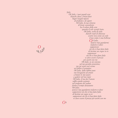
by Laura Ruggeri STORY Here he is again, Antonio (Associazione Progetti Culturali), asking for another calligram. This time for the corporate image of a theatrical play that he and his friend Bruno Guerra wrote: Il blues di Monsieur Malaussene . "Laura, make it sexy!", Antonio said while he was walking away from my studio. "Sexy?" I thought, "Why sexy? What is this play about?". I close the door and went to read the play with curiosity. I chose the sexiest scene of the play for the calligram: Oh Julie . "What do you think, Antonio, is this sexy enough?" "Yes! I like it very much." So the sexy calligram went on street posters, flyers, invitation cards... and then in my portfolio online . I don't know why... or maybe I know exactly, but I was never comfortable with this calligram. "Too sexy...!? What if my yoga teacher see it? What can he think of me?" Many thoughts came to me for so many times,