Posts

Showing posts from 2008

Poinsettia, the Star of Christmas

Image
Text by  Arianna Papini  - Calligram design by Laura Ruggeri Once upon a time there was Laura, a little woman with splendid fairy eyes and, at the same time, far far away, there was the mom of Laura. A great space divided them, but they had in common a subtle magic ability: they were able to buy the stars. [ continue... ] PS - Inspired by a true story.

Animated Calligram for the Holiday Season

A Day passes in the city. The Sun changes to the Moon. The bright Sky changes to starry firmament of Night complete with a shooting Star.  All created with the LiveType font named Marquee . Animated calligram design by Laura Ruggeri   for Screen Caffeine (producer of LiveFonts for LiveType application). > visit the website of Screen Caffeine to view other animated calligrams

3D calligram: House of Knowledge

Image
A friend of ours, Daniela Ferrando, a copywriter who also has a passion for calligrams, pointed out this very unique 3D calligram: House of Knowledge by Jaume Plensa . «Knowledge is somehow woven with words. I say woven instead of written, trying to capture the subjective, creative and cooperative nature of knowledge - something intimate and readable at the same time. That’s why I chose this installation as a 3-D calligram.» — Daniela Ferrando

Bembo's Zoo

Image
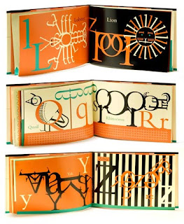
by Roberto de Vicq de Cumptich Very creative calligrams of animals using the font Bembo. The book published by Henry Holt and Co. is available on Amazon . But it's very interesting to watch the same calligrams "animated" on the website BembosZoo.com . Here the use of Flash, motion and sound add more character to each animal/calligram. "This high-concept abecedary, the picture book debut for de Vicq de Cumptich, should delight collectors of stylish picture books and aficionados of the graphic arts" —Publishers Weekly "In this first book for children, de Cumptich,... has created an abecedary of animals made entirely from bembo letterforms and punctuations marks-nothing els. And you know the conceit works." —New York Times It's just a joy to see these calligrams. Bravo Roberto!

Objectified... word

Image
" Objectified is the new film from director Gary Hustwit . It's about industrial design, and the creativity at work behind everything from toothbrushes to tech gadgets. It's about the people who re-examine, re-evaluate and re-invent our manufactured environment on a daily basis. It's about our relationship to mass-produced objects and, by extension, the people who design them." (from HelveticaFilm.com website) ... and the calligram logo speaks clearly what the documentary film is about. Notice In this case the concept of the calligram is reversed: it's not the image made by words, but the word made by images... well, objects. So, how can we call it? perhaps "objectified" word . Calligram design by Michael C. Place .

Oh Julie

Image
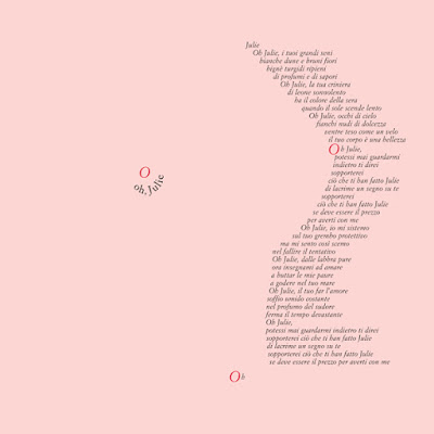
by Laura Ruggeri STORY Here he is again, Antonio (Associazione Progetti Culturali), asking for another calligram. This time for the corporate image of a theatrical play that he and his friend Bruno Guerra wrote: Il blues di Monsieur Malaussene . "Laura, make it sexy!", Antonio said while he was walking away from my studio. "Sexy?" I thought, "Why sexy? What is this play about?". I close the door and went to read the play with curiosity. I chose the sexiest scene of the play for the calligram: Oh Julie . "What do you think, Antonio, is this sexy enough?" "Yes! I like it very much." So the sexy calligram went on street posters, flyers, invitation cards... and then in my portfolio online . I don't know why... or maybe I know exactly, but I was never comfortable with this calligram. "Too sexy...!? What if my yoga teacher see it? What can he think of me?" Many thoughts came to me for so many times,

27 DRESSES

Image
A 27 dresses calligram gown for Jane before she could finally wear her very important 28th one! A very joyful poster movie for a very light hearted movie that talks about the emotions and the transformation of a woman who could always be a bridesmaid, never a bride, until... Must see! 27 Dresses 20th Century Fox, 2008

TIM 2008 Summer Promotional Campaign

Image
This 2008 Summer is turning out a very happy season for calligram design! At least in Italy. TIM , Telecom Italia Mobile, chose calligrams for their 2008 Summer Promotional Campaign. We post here only two of them. Please, visit TIM's website to see the others calligrams. We think it's very creative, the word AMICI (= friends) is made by a group of friends, a picture of real people. The concept is the same one used by Erté (1892-1989) in his very well known alphabet. Unfortunatelly we could not find out who is the calligram designer for the TIM campaign. If by chance you know who she/he is, please let us know, we will be very happy to put her/his name in our Calligram Designers list. Thank you.

Feltrinelli 2008 Promotional Summer Campaign

Image
Feltrinelli , an Italian publisher, chose a calligram for their 2008 Promotional Summer Campaign. The slogan says " At Feltrinelli the world is closer. ": Feltrinelli takes you all around the world showing you different cultures, people and places through a rich selection of books and authors. The calligram world is made by words : music, culture, books, bookstore, travels, games, events, video, instruments, earth, fantasy, adventures, news, imagination, entertainment, etc. The calligram design is by Miguel Sal & C.

The Thinker/Ecclesiasta

Image
by Laura Ruggeri STORY I designed this calligram in 1996 for the theatrical season Poeti Filosofi e Giullari. Antonio Molinari (Associazione Progetti Culturali), the actual client, came to my studio and asked: "Laura I need an unique image for the next season. You have a blank slate. Surprise me." I asked Antonio what was the main show of the season: "The Qohèlet - The Book of Ecclesiastes", he answered. I designed and patiently typeset by hand this calligram using all of the text of the book visualizing The Thinker of Rodin in type as a symbol of the human being who thinks "Completely meaningless, completely meaningless! Everything is meaningless" as Qohèlet said. It took 21 days to produce this calligram. TECHNIQUE The font used for the calligram is Helvetica Neue - from UltraLight to Black + ExtraBlack crafted just for this project. 7 weights in total. APPLICATION poster, libretto cover, flyer, invitation card

A calligram is...

Image
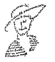
... a poem (though can also be a phrase or single word) in which the typeface or handwriting forms are an important part of the focus. Indeed, it is a visual manifestation of themes presented aurally and textually. Guillaume Apollinaire is a famous calligram writer. (from Wikipedia) Apollinaire once said to his friend Picasso, «Anch'io son' pittore - Me also I am a painter!»

Welcome to Calligram Designers!

Calligram Designers is a group of graphic designers, artists, illustrators and writers. Our mission is to promote calligrams as a powerful and creative visual communication technique that might enhance our personal and business work. In this blog you can view the best examples of calligrams from all over the world.